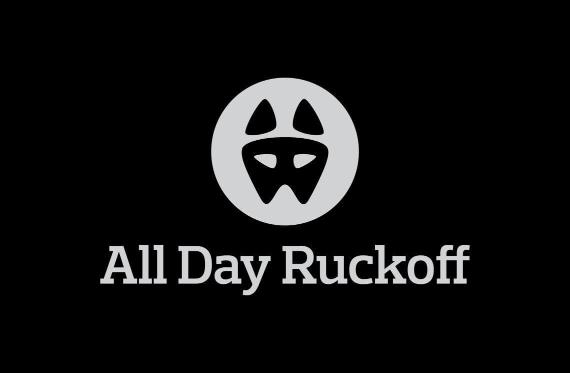
You may have noticed that the logo on the website has changed and is no longer a beer stein. Why the change and what does it mean? Here’s the explanation.
Logo: The actual logo is a dog’s face. Everything is mathematically proportioned to look and feel both symmetric and “right”. The dog has been positively symbolized for ages and if there’s one thing we try to be on this site it is positive. In addition, many of us do our training with dogs (just look at the popularity of the GORUCK Kennel Club) and appreciate the traits that they have. The goal was to end up with a logo that brought positive characteristics and had meaning.
Symbolism/Meaning: From Greek mythology to Alexander the Great to Sergeant Stubby to present day, dogs have continued to symbolize (and show) positive traits such as loyalty, reliability, hard working, trustworthiness, and protectiveness (just to name a few). We wanted a logo that would make us think of these traits… traits that we want to have for ourselves. In addition these are traits that we see all throughout the GRT community… a community that has shown itself to be incredibly positive, uplifting, and caring.
Simplicity: We wanted a simple logo… something everyone could relate to and understand. Even if you don’t have a dog you’ve seen one. You know what they are, what they do, and the work that they’re capable of. There were a ton of iterations of the logo with varying displays of detail. In the end the one chosen was the most simple one that still got the point across. Below you’ll see another logo that we also have (and like a lot) but decided against making the official logo.
We wanted something simple so that if people have a dog they could look at it and think of their own. Something too detailed makes that near impossible… for example if you don’t have a husky, shepherd, or border collie the one above probably won’t mean much to you. The idea behind the simplicity was that we wanted the logo to mean something to us, and hopefully something to you as well.
Site Evolution
The website has evolved since it was started almost two years ago. Back then it was mostly workout ramblings, beers to drink while rucking, and some training advice. The beer stein logo fit perfectly in all of this… we didn’t take ourselves too seriously and loved to have a good time. We still don’t take ourselves seriously (unless it involves the store) and still love to have a good time (Follow on Untappd in the race to 1,00 unique beers). That being said, for better or worse, We’ve pulled away from the beer ramblings and have focused more on training, event prep, and AARs. The beer stein logo will still be around (St. Patrick’s day variant anyone?) but we wanted to transition the main logo to something a little more timeless.
If you have any questions about this please feel free to ask either as a comment, on Facebook, on Twitter, or by using that fancy “Send Me A Message” button at the top right. We hope that you now understand the new logo a little bit better and have some insight into why the change was made.
