

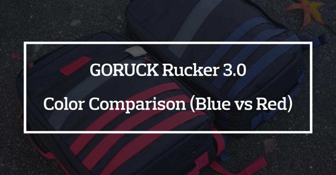
When GORUCK released their Rucker 3.0 they did so in two colors: blue and red. After looking at the pictures on GORUCK’s website I opted to purchase the Rucker 3.0 in red. Both of the colors looked bright (to me) and when push comes to shove I prefer red over blue.

When the Rucker 3.0 showed up I was pretty shocked at just how bright it was. I own the old Rogue Fitness Black/Red GR1 and it was a much duller red… so I was hoping for something more in line with that.
I shot the video above without any color correct and somehow the pack ended up looking slightly orange. I can promise you that it does not look orange in real life. This led to me trying to capture what this pack actually looks like to make amends for the color in that video.
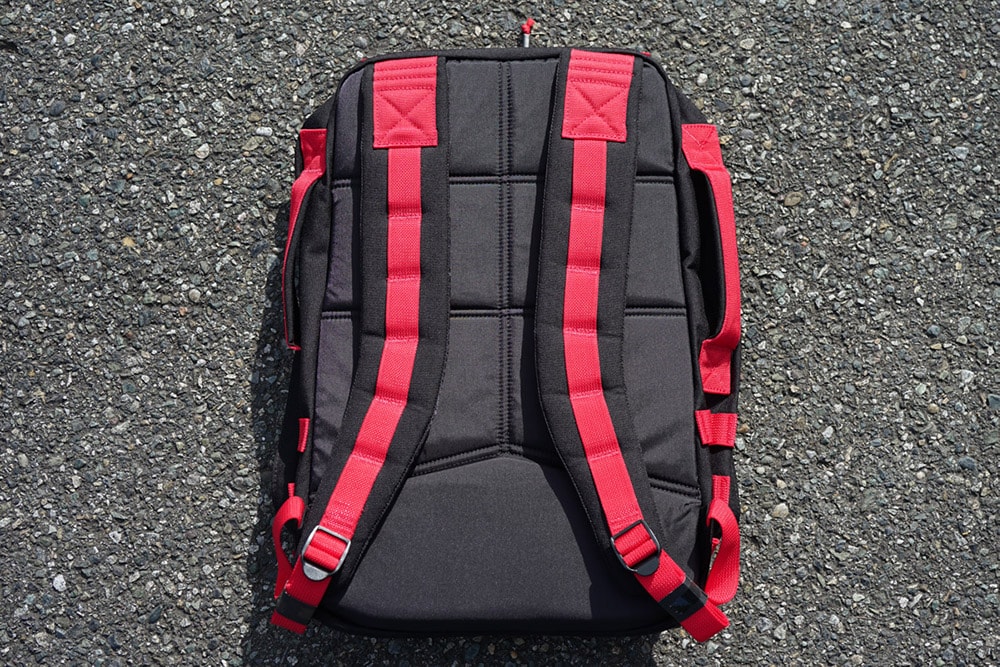
I ended up taking it outside and using different lighting to capture the same red on the camera as I was seeing in person. It is a very red pack… the red used feels even more red than the EVERGOODS CPL24 that came out in Ultra Red.

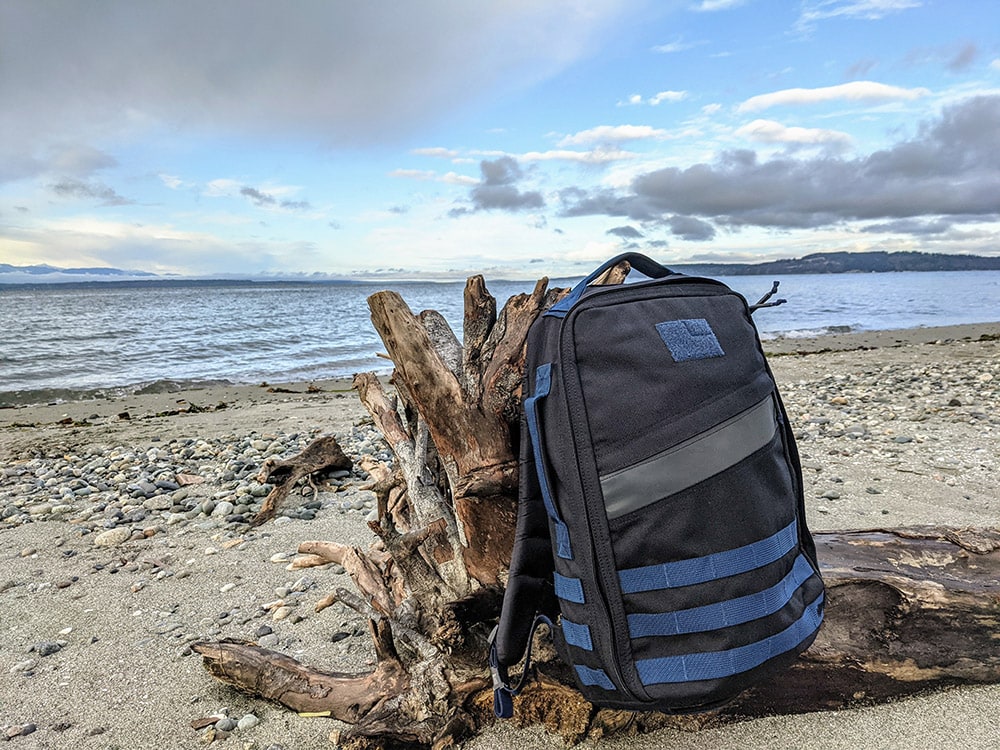
Then, as luck would have it, I was able to get my hands on one of the Rucker 3.0 packs in blue. I was blown away by how much I enjoyed the blue color… it was so much better in person than I expected based on the pictures I’d seen.
The Video

I ended up shooting a video trying to show the difference in colors between the two packs. I also get into which color I like better.
The Comparison

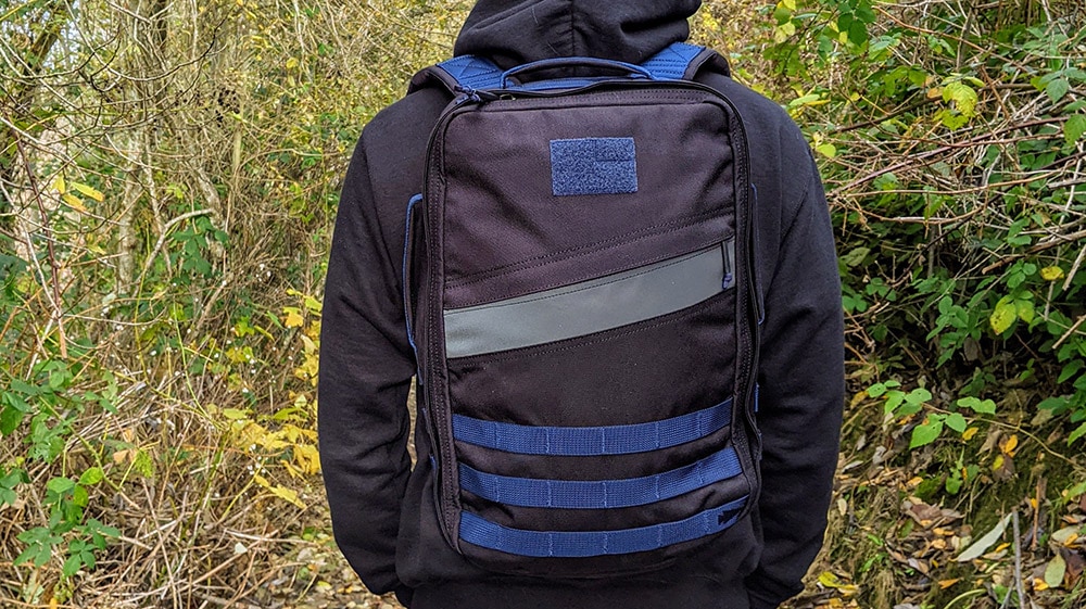
The problem with the blue color was that it was difficult to photograph as well. When I look at it it looks a lot duller than the outside pictures above.
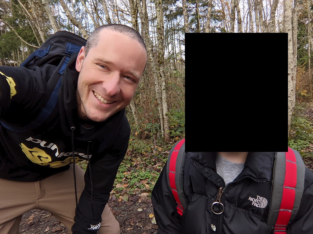
The above picture is myself and my son on a hike. He’s got one of the older GORUCK Kid Rucks on and I’ve got that Rucker 3.0 in Blue. To me that picture looks a bit darker than the one before.

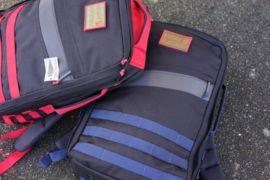
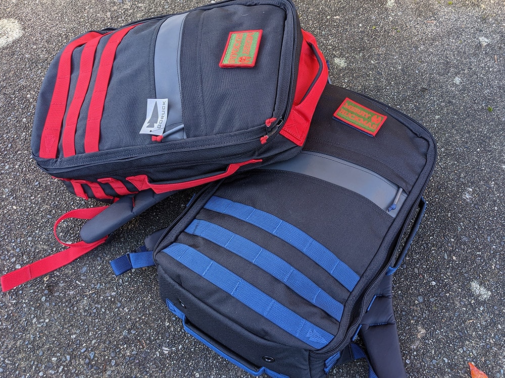
Finally, I figured we’ve gotten this far why not try and compare the packs to each other. If they both are tough to photograph alone then let’s see how they photograph together. Here’s the two packs together outside in the shade. Photo was taken with my Sony a7 II.
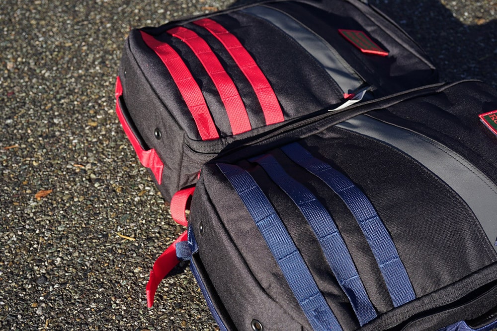
Here’s the two packs roughly 3 minutes later and 6 feet to the left in the sun. This photo was also taken with my Sony a7 II.
Then here’s the two packs in the shade with the photo taken on my Google Pixel 4a phone.
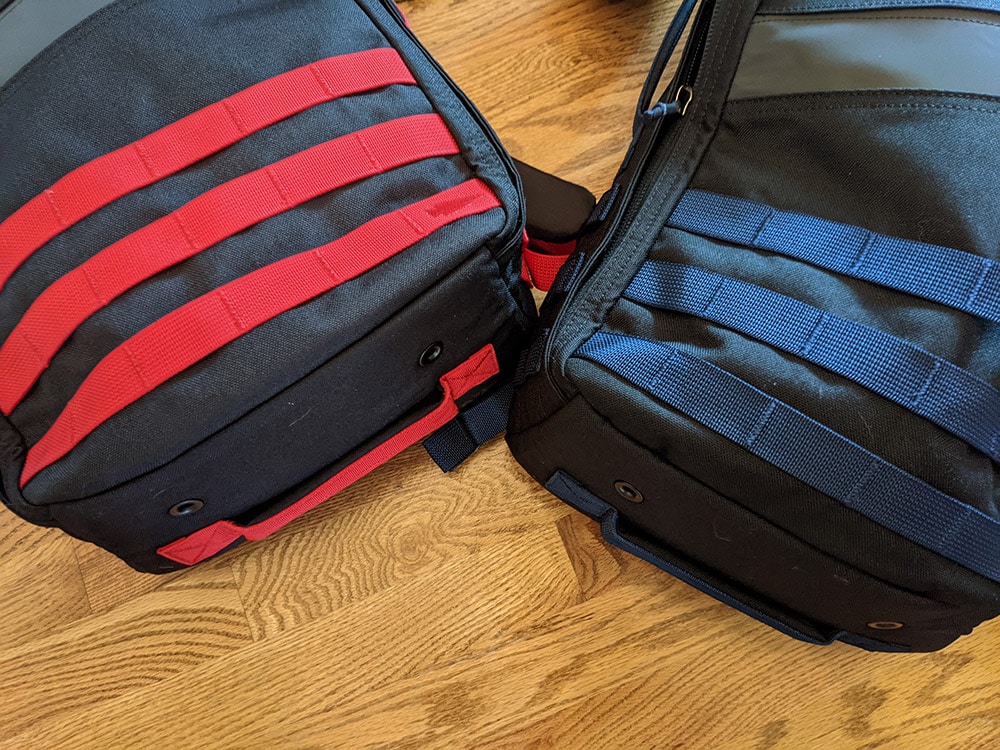
And finally here’s the two packs inside the house in my entryway. You can tell the red still looks very red but that blue looks like a darker blue.
Parting Thoughts
The Black/Red Rucker 3.0 is very red all of the time. The Black/Blue Rucker 3.0 shifts from a darker blue to a brighter blue depending on lighting and the situation. When it comes down to it I like the blue a lot better. I could almost see myself using it as an everyday carry bag because of how nice the color is. The red looks red. It’s a bit too red for me but I’m sure there’s a group of people out there that really like it. Definitely not saying it’s a bad color just that it’s not for me. If you have a preference between these two colors I’d appreciate your opinion in the comments below!